9[1q4C]?aX6jjK\Yf9qZJw9\3ZnpuLpwu>A>wXk
After the sketch session last week, it was all about wireframes this week.
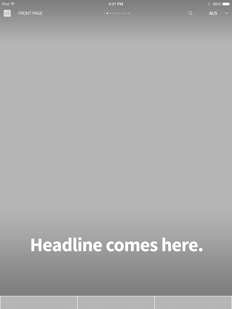
Front Page
Nothing too crazy is happening here. Just like the original app, the first screen purely focuses on the front page news.
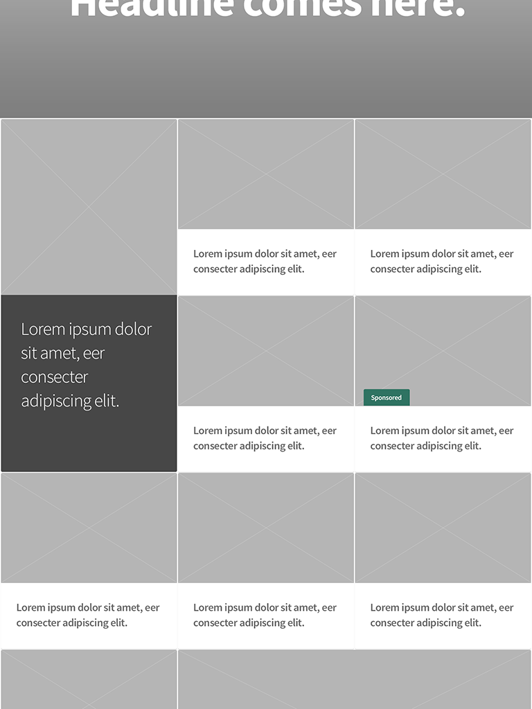
Article Blocks
The article blocks are slightly retouched and organized in a much cleaner format.
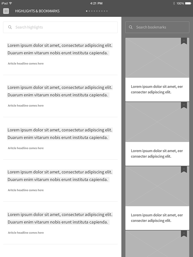
Highlighted Texts & Bookmarks
Texts that users highlighted and bookmarked will be placed on this screen. This section is accessible from the front page by swiping left.
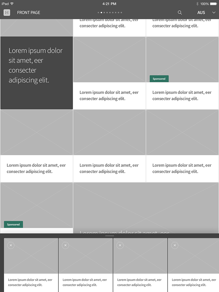
Reader Queue (Bottom of the Screen)
Users can double-tap or hold and drag to add any article block into the queue.
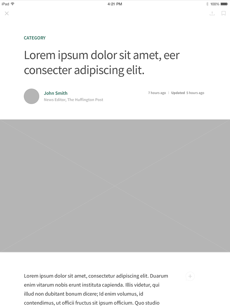
Article
Retouched a bit. But didn't change too much from the original version, so users can naturally adapt.
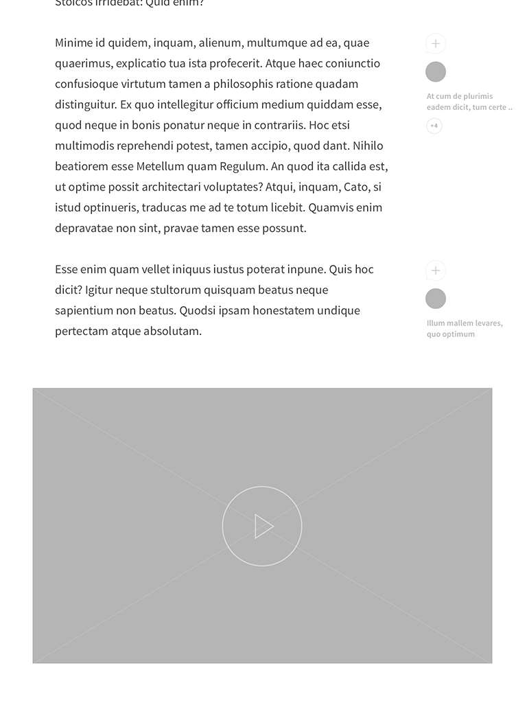
Dynamic Comment Feature
This idea is inspired by Medium. Users can tap the plus bubble icon to add their comments directly to each paragraph.
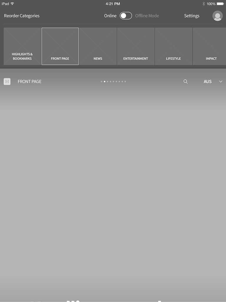
Settings - Front Page / Sections
Accessible by pulling down the front page or section screen. Originally, it was a refresh feature; however, the app doesn't constantly update and refreshes on launch. So I thought I could tweak this a little to make the extra feature set more reachable.
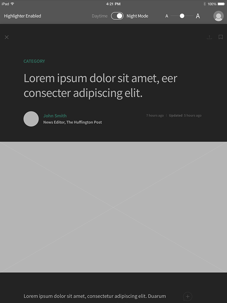
Settings - Article & Night Reading Mode
The same mechanism here as the previous screen. But the setting options are different. Also, the night reading mode is activated on this article screen.
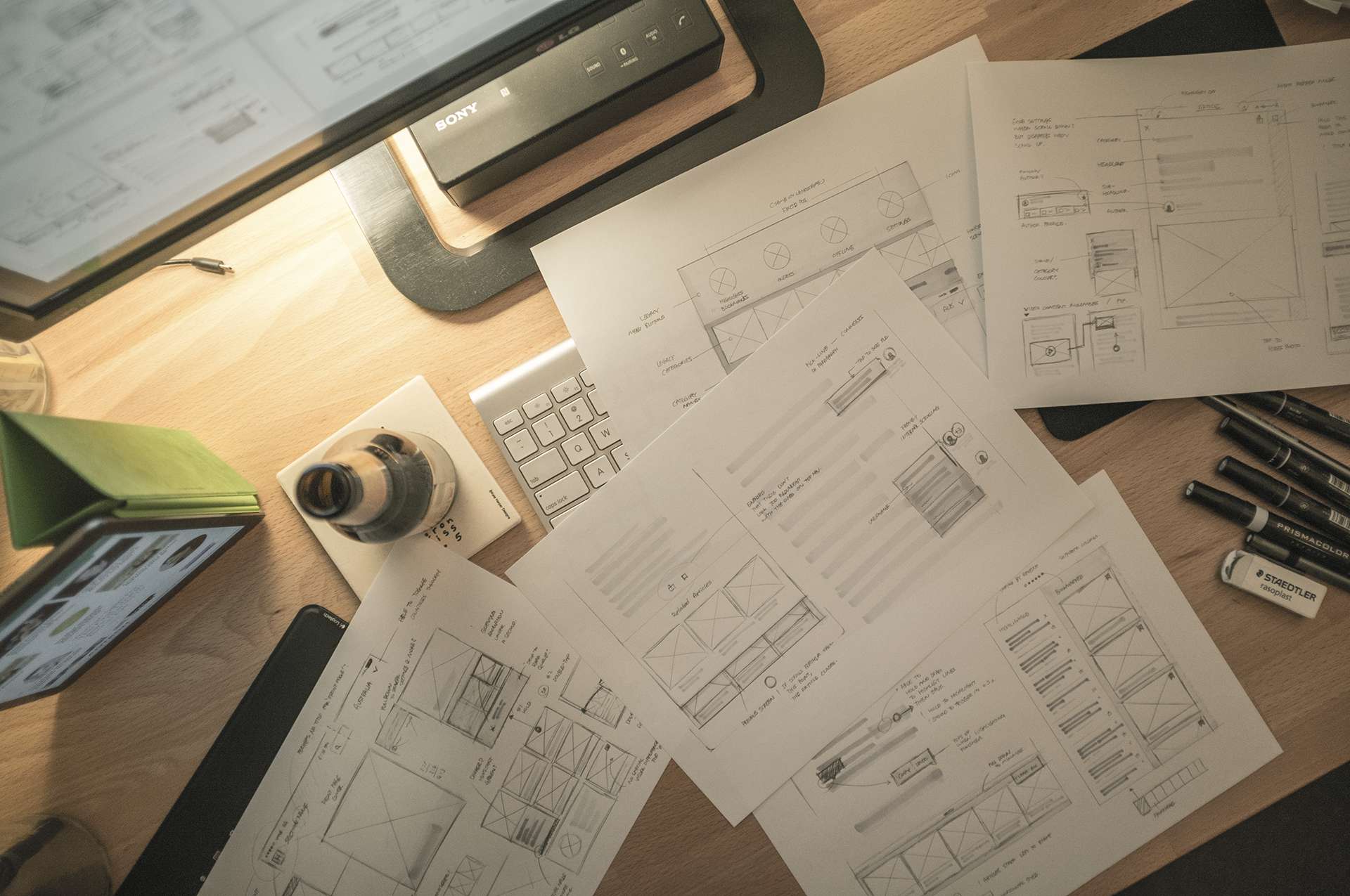
Sketch Session Last Week
Yes, I had some beer when I was having a sketch session last week. Also, just wanted to remind you what happened last week for part 1.